The existing kitchen was a basic new-build installation where colours had begun to fade and mismatch, storage had not been prioritised and the room no longer felt personal to the client.
The footprint could not change dramatically, so the focus was on improving how the kitchen looked and worked within the space available.
The brief
The client wanted a kitchen that felt much more like their own.
Colour and style were especially important, alongside better-quality materials and a significant improvement in storage. The existing straight-run layout also meant that every cabinet needed to work harder.
Design direction
The aim was bright, modern and clean-lined, with enough personality to make the kitchen feel distinctive.
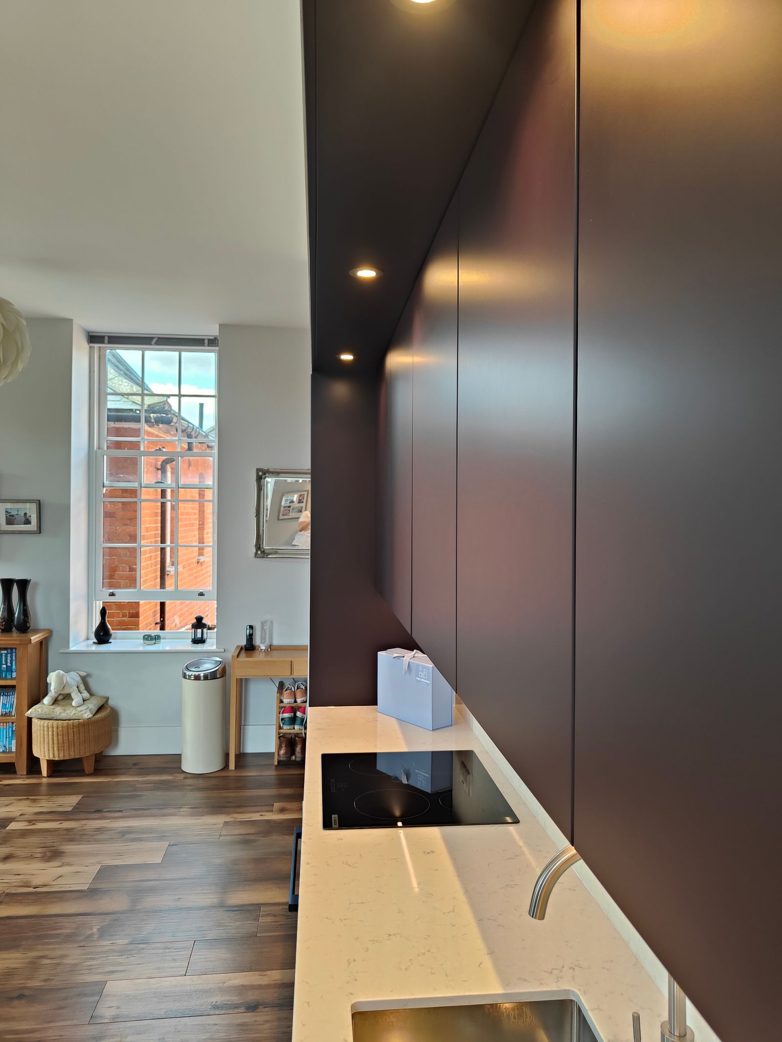
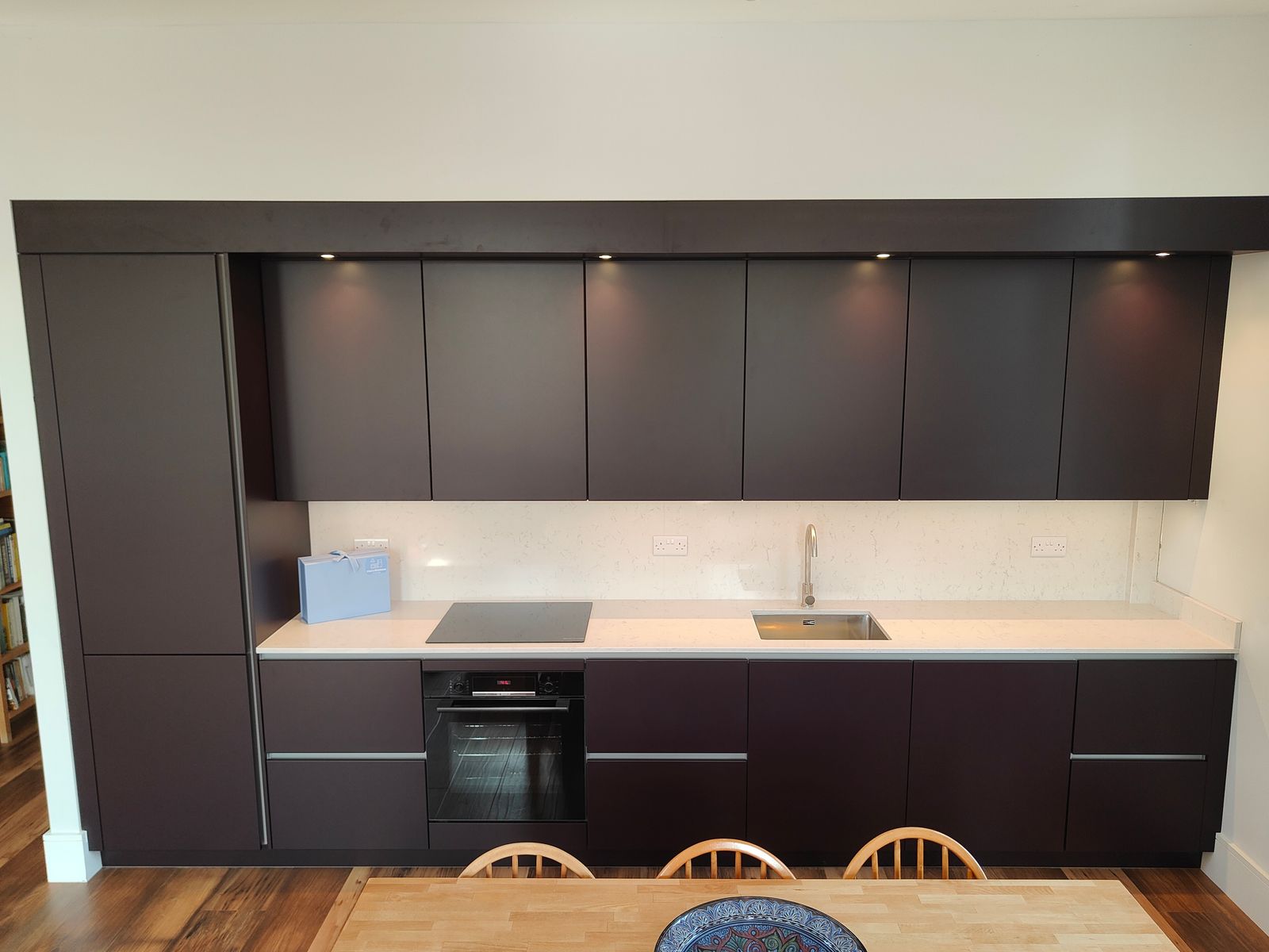
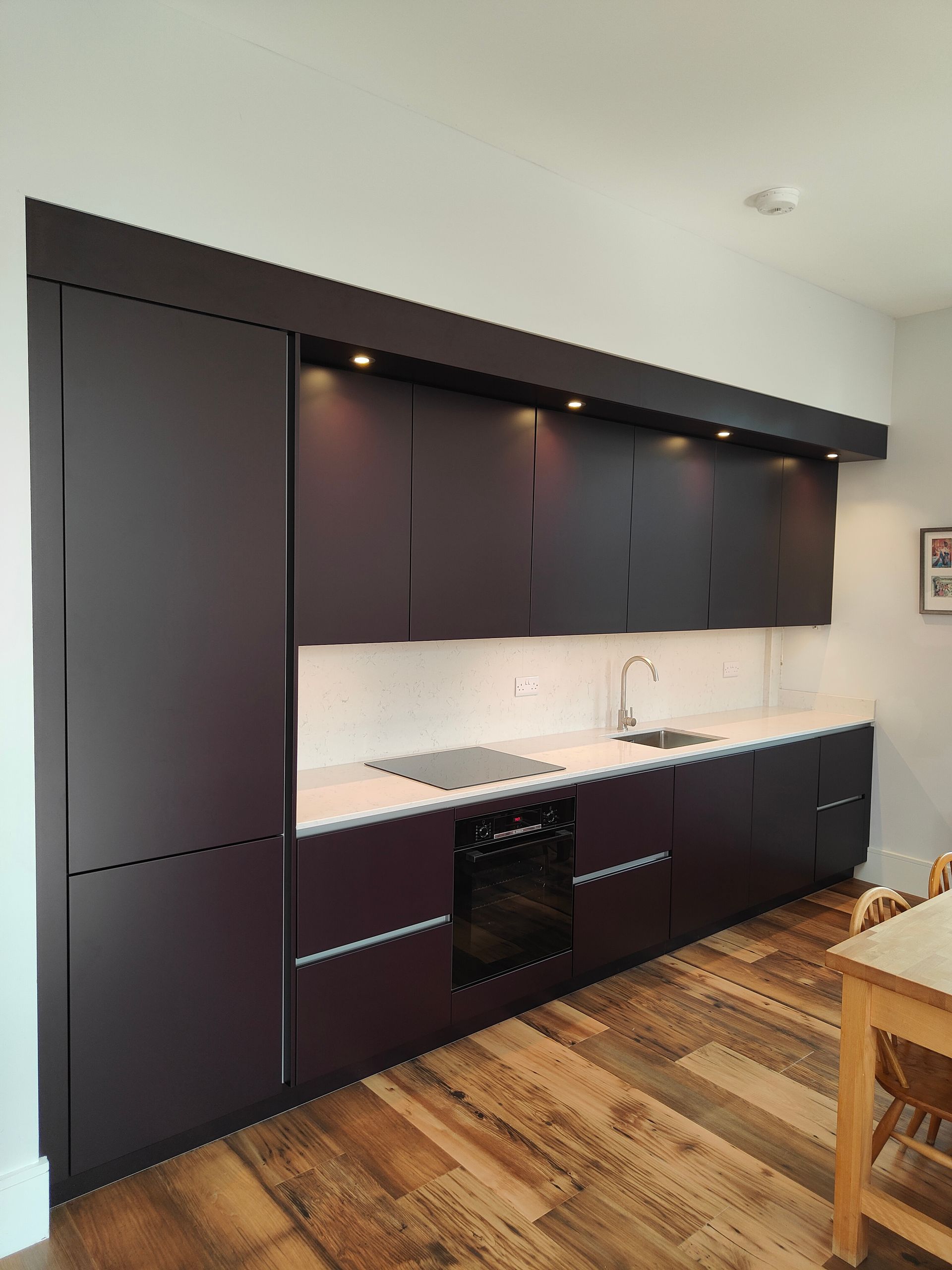
Aubergine frontals were paired with white quartz worktops, reflecting the client’s love of purple while keeping the overall finish sleek and contemporary.
Rather than forcing a different layout into a restricted footprint, the design focused on making the existing run feel more ordered and intentional.
Making the space work harder
Cabinet sizes were equalised into consistent 600mm blocks across the space, bringing greater symmetry to the run.
Storage was improved substantially by:
- taking the wall units higher
- assigning individual cabinets to specific purposes
- introducing more drawers
- integrating all appliances
- organising storage around how the client actually uses the kitchen
The result is a kitchen that is easier to organise and simpler to use day to day.
Working within the constraints
The main challenge was the available footprint. The kitchen could not be extended and the straight-run layout left limited scope for major structural change.
The solution was to understand which functions mattered most to the client and make those needs part of the design itself, rather than treating storage and usability as an afterthought.
The flush installation into the recess also helps the finished kitchen feel deliberate and properly fitted to the room.
The result
The finished kitchen feels unique to the client rather than like the standard new-build kitchen it replaced.
The aubergine colour gives the room its character, while the stronger symmetry, higher storage, additional drawers and integrated appliances make the space considerably more useful without increasing its footprint.
Client feedback
“I was fairly clear about what I wanted in terms of the symmetry of it, and what I was going for, and Oli kind of pulled out a whole range of things that sort of met those requirements, and I’m really pleased with the end result. I think the first thing that struck me was that it was actually exactly as I expected it to be.”
“It’s turned out brilliantly, why didn’t I do it sooner!”